
Corporate Identity
KNF becomes aware of the importance of a company’s name, logo and brand image early on in its history. In the 1970s, the company urgently has to clear up confusion caused by its name when orders are repeatedly sent to a Munich-based fittings company called Josef Neuberger by mistake. The decision is made to change its name from Kurt Neuberger Freiburg to KNF Neuberger. The corporate design consists of a small blue sticker representing KNF Neuberger Freiburg with an elongated “N.”
But such a basic visual representation like this does not fit the bill these days. Identity, image, self-perception and perception by others play a huge role in modern life. For companies that need to present themselves to the outside world, choosing a corporate identity is a crucial endeavor. The term “corporate identity” has a comprehensive definition and covers a company’s conduct and presented image, internal communication style, philosophy and company culture. This all needs to be portrayed by a uniform look and feel. In terms of presented image, it is essential to have a recognizable profile or brand that is unmistakable to customers. This is because a distinctive, trustworthy brand that sets a company apart from its competition heavily influences purchasing decisions.
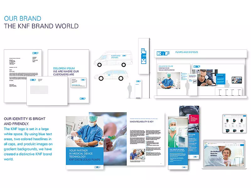
A company’s brand is most clearly depicted by its corporate design, which encompasses everything from a logo to the colors and fonts used. However, since design tastes change over time, corporate designs also need a facelift every now and again.
A technology leader like KNF – which counts innovation, excellence and reliability as its brand values and provides true added benefits to its customers – should let its true light shine. Humility and modesty may be honorable virtues, but they are not exactly useful in the face of stiff competition. When KNF conducts a brand development process in 2013, it realizes that it needs to present itself somewhat more openly, with greater self-confidence and to be less austere and reserved than it has been for years. This would help the KNF brand to stand out from the competition. It is also determined that the international KNF Group needs a uniform global image so that all of its customers will immediately recognize the KNF brand and – more importantly – its products worldwide, preserving the trust placed in the brand.

At the end of the brand development process, the existing versions of the logo are standardized, the website gets redesigned, modernized and given a new, user-friendly navigation structure, and all the various elements are colored much more boldly. The result is a consistent overall impression with powerful colors and photos featuring real people. It exudes self-confidence and conveys an important message: “This is who we are, this is what we look like – and we are proud of our achievements.”

KNF Blog Knowledge Flows
Follow the latest trends and stories on how diaphragm pump technology drives evolution in the market.
Knowledge Flows